CD Art - Final
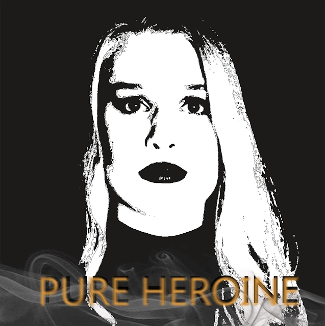
Down below is our final product for our CD cover. We made a few changes since my last post as we got some feedback from other students on how we could make it better. This included changing the title on the front of the CD to a 'soft gold' colour to make it stand out more to the audience compared to the black titling that we had previously in my first draft. We also faded the text, this was done so it blended in more with the smoke at the bottom of the image and with the image of Amy.
In regards to the insert booklet, we changed the contents which was in it and removed the lyrics and replaced them with credits for the album 'PURE HEROINE', we decided this was the best idea as we could not fit all the lyrics in the insert booklet, due to it only being four pages long. We also added a "special thanks to" page on the back of the booklet with the same colour scheme as the CD cover itself. Additionally, in the insert we changed a few of the backgrounds which we believed could be better and replaced them with different photos with fit the style of our artist more compared to the previous photos.
Front cover:
Front and back of the insert booklet:

Inside pages for booklet:

Back cover:

In regards to the insert booklet, we changed the contents which was in it and removed the lyrics and replaced them with credits for the album 'PURE HEROINE', we decided this was the best idea as we could not fit all the lyrics in the insert booklet, due to it only being four pages long. We also added a "special thanks to" page on the back of the booklet with the same colour scheme as the CD cover itself. Additionally, in the insert we changed a few of the backgrounds which we believed could be better and replaced them with different photos with fit the style of our artist more compared to the previous photos.
Furthermore, the back cover was also changed as previously we had the 'DAKOTA' logo which is on the merchandise, however this has be changed as the logo was too dark to fit on the back of the black cover and was hard to see. Therefore, we decided it would be best to change the logo to a 'soft gold' colour, similar to the front, which will keep the continuity between the product and make it look a more professional product.
Overall, throughout our insert booklet we have kept the consistency of the dark black and white theme which is evident between our social media sites, website and music video.
Front cover:
Front and back of the insert booklet:
Inside pages for booklet:
Back cover:


Comments
Post a Comment